Representing History, Community and Living
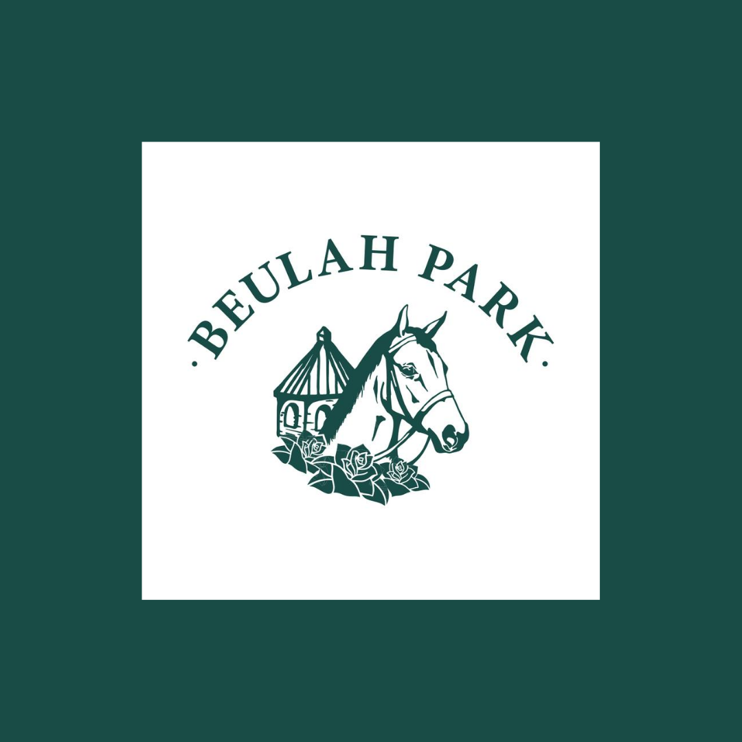
Earlier this year we took the bold step of redesigning the Beulah Park logo. We partnered with ForeFront Web on the creation of a new logo and website.
ForeFront Web Designer Sarah Meier, known for her ability to turn designs into magic, graciously shared what the process looked like through her experience. Here is the WHY and HOW the new Beulah Park logo came to be.
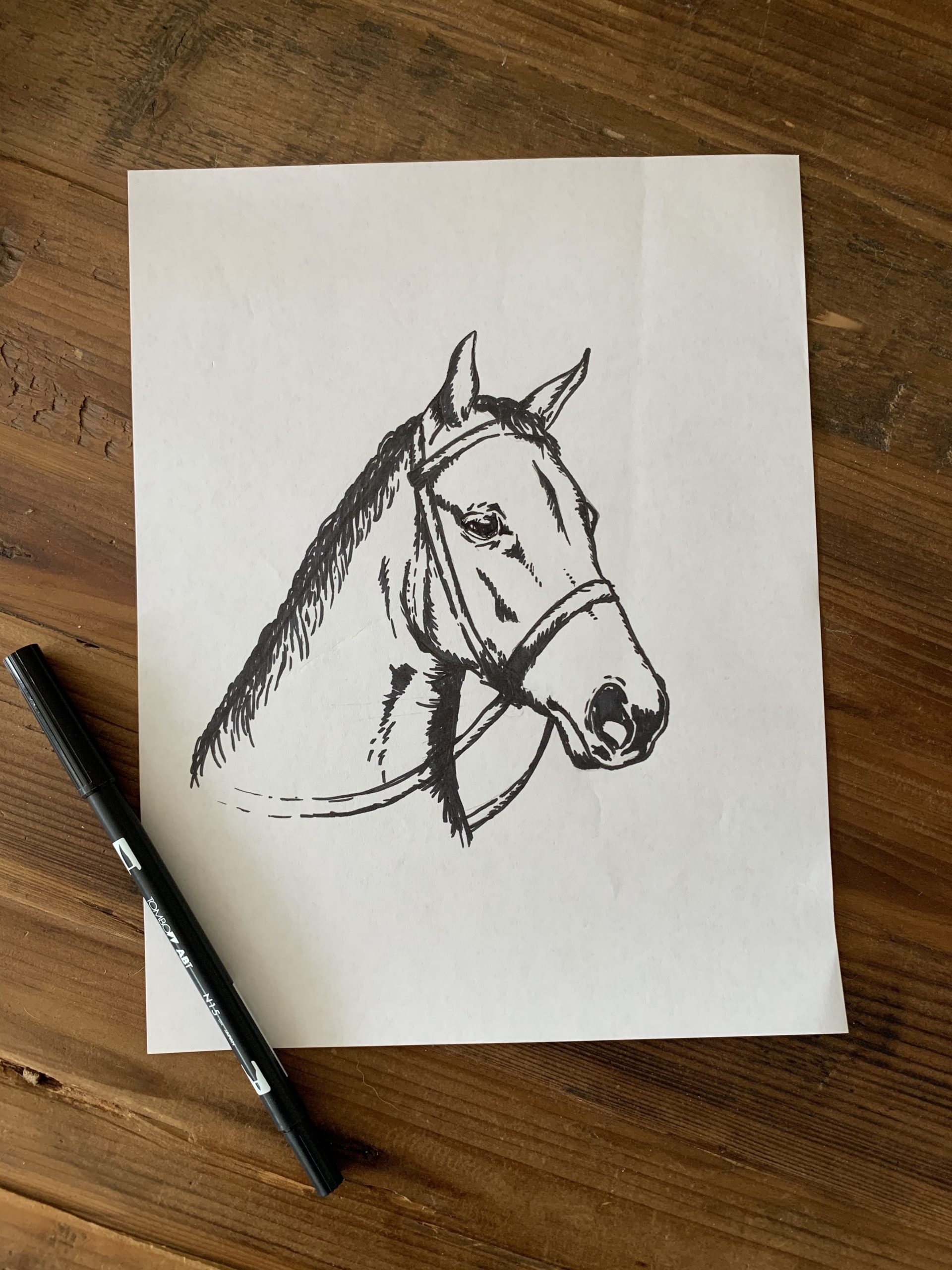
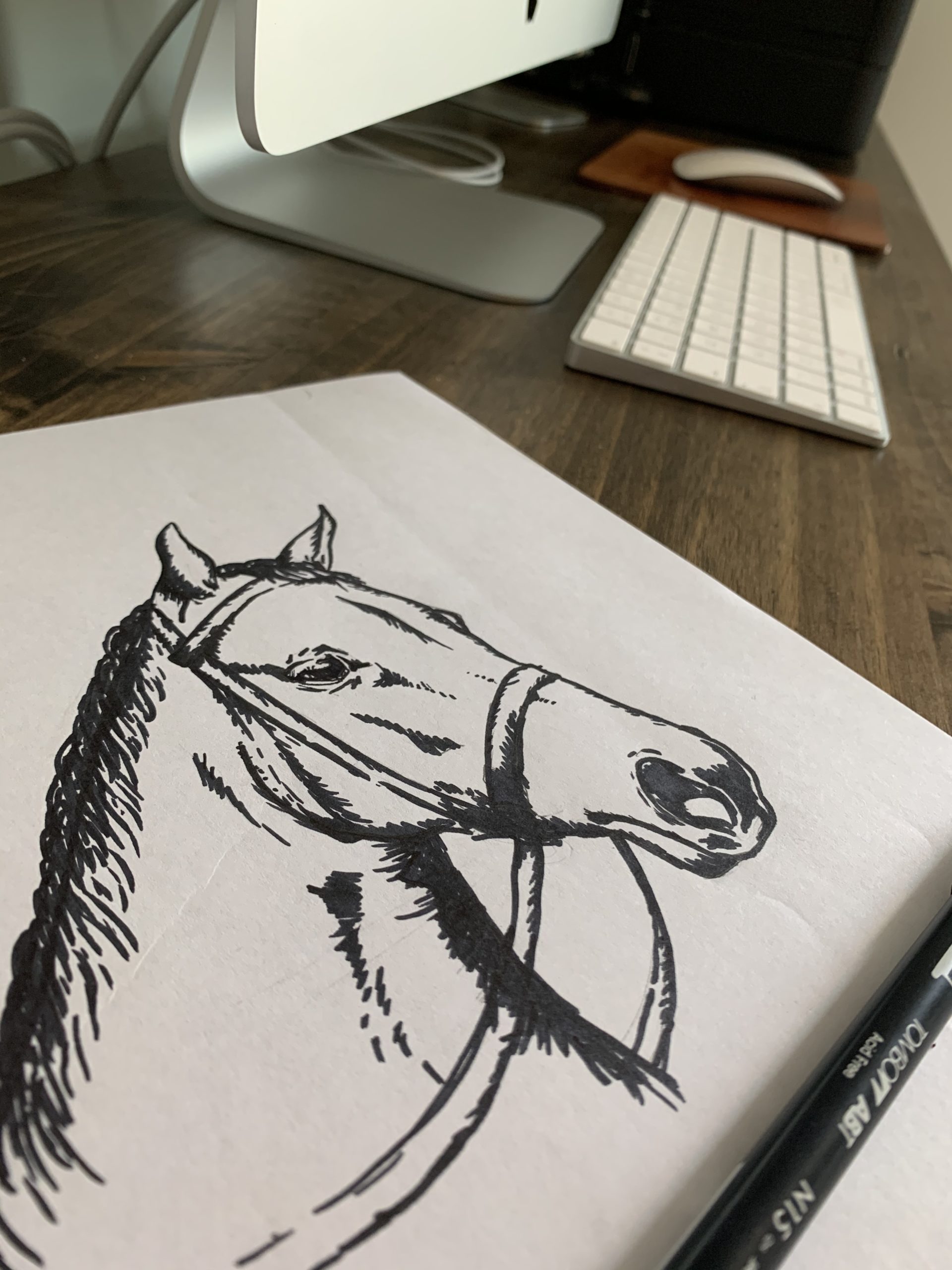
You used a photo of Glacial Princess as your inspiration. Can you share why? And what did your process look like? We wanted to play with the idea of bringing the concepts of History, Community and Living together. What better way to start than with Glacial Princess herself – the star of what Beulah Park used to be! We wanted to pay tribute to what once stood where the neighborhood stands now.
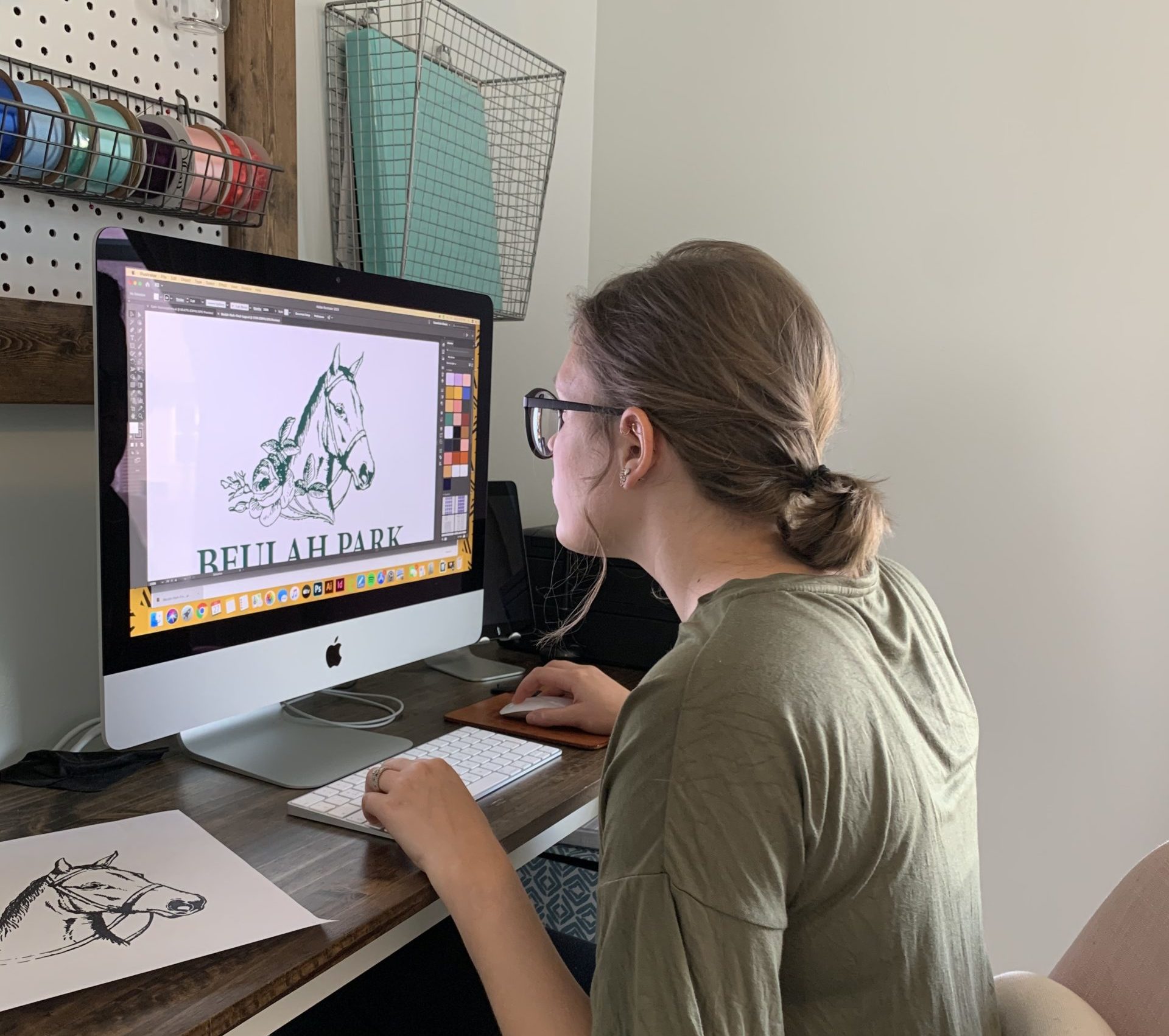
What else went into designing this logo? The logo is the product of a lot of collaboration between the ForeFront Web and Beulah Park teams, and a lot of discussion about what we wanted the logo to say to people. We wanted it to be modern and stand out today while keeping the history intact.
The team at ForeFront includes a number of Grove City residents. Can you share the input and insights they provided? Julie and Kyle were great to bounce ideas off of during this process. They know the history as well as the modern-day community, and they know how much of a positive impact Beulah Park is going to have on Grove City
During this process, what brought you the most enjoyment? Being able to use hand-drawn elements to create one of the logo designs was really fun. Even though the product of that process isn’t the main logo being used, it was still exciting because it’s not something I get to do often.
What was the biggest challenge? At first blush, you might not think there are many similarities between a historic racetrack and a vibrant new neighborhood. As a result, it was a balancing act to capture what Beulah Park is today without glossing over its history.
How do you see this logo living into the future?
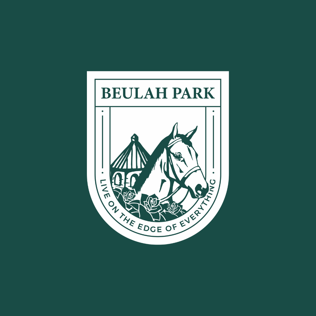
The “badge logo” featuring Glacial Princess, I imagine, will be used for special occasions – celebrations, community events, that sort of thing – in the future. You can feel the history in this logo, and no one will ever forget how Beulah Park started.
The end result included three different logos. We found it so interesting that one is being referred to as a badge and compared with the Ohio State Crest. Please share your thoughts.
Having all these options is great! They can be applied to different elements of the neighborhood and its marketing, be it digital, print or merch. Beulah Park now has a logo for any occasion, and each of them is recognizable as both a unique facet of Beulah Park and as a pivotal part of Grove City’s history.